Pages

samedi 28 février 2009

I Am Still Alive / Je suis toujours vivant !

Je suis toujours vivant ! Une grippe géante a causé ma disparition des ondes pour plus d'une semaine. La mère de toutes les batailles, aurait dit le misérable Saddam. Une bataille que je suis en voie de gagner, mais qui m'a vidé de toute énergie. Je recommence à faire de la photo aujourd'hui, enfin !
Des nouvelles fraîches bientôt ! Commentaires et suggestions bienvenus, comme d'habitude.

•••••••••••••••••••••••••••••••••

I am still alive! A major flu attack kept me out of business for more than ten days. The Mother of all Battles, would have said the miserable Saddam. I'm finally winning but a bit exhausted. I am going outside and doing photography again today. Finally!
News very soon... Comments and suggestions welcome as usual.


lundi 23 février 2009

House By The River (bis) / La maison près de la rivière (bis)

House By The River: I Prefer The Black & White:

I worked this image as a black and white one, for reasons of my own (what else is new?). I worked a bit on the colour version and include it for comparison purposes. Also, have a look at the snow's changing colour! This is one of the difficult points about snow in photography, along with exposition. I shall discuss these two points in another post.


Thanks to Patrice and others for suggestions about the black and white.


Comments and critiques most welcome. Suggest other ideas if you wish.


•••••••••••••••••••••••••


La maison près de la rivière : Je préfère le noir et blanc

J'ai travaillé  cette image comme une image noir et blanc. J'ai aussi travaillé un peu la version couleur que j'inclus aux fins de comparaisons. Aussi, regardez la couleur sans cesse changeante de la neige ! Il s'agit là d'une des difficultés présentées par la neige, avec l'exposition. Je reviendrai là-dessus plus tard.


Merci à Patrice et aux autres pour les suggestions au sujet du noir et blanc.


N'hésitez pas à critiquer et à commenter, ou suggérer autre chose.


-- RogerG


Look at the colour variations in snow! / Regardez les variations de couleur dans la neige !


A bit more ligjht and zone contrast / Un peu plus de lumière et de contraste par endroits

mercredi 18 février 2009

La maison près de la rivière / House By The River

Neige et soleil ne font pas bon ménage
Neige et un soleil de face : rien de pire pour le photographe. Le piège : les zones complètement blanchies par le soleil. À éviter à tout prix. Ici, j'ai utilisé au départ la commande méconnue "Equalize" de Photoshop, suivie de "Shadows/Highlights", pour terminer avec de multiples corrections à l'aide de caches. Le résultat final est moyen mais bien supérieur à l'original, je pense.
Vous pouvez voir à la fin de ce message la photo originale (en format jpeg toutefois). Ceux qui voudraient tenter leur chance avec l'original RAW peuvent le trouver ici.
Commentaires et critiques bienvenus. :-)
RogerG
••••••••••••••••••••••••••
Sun And Snow: Often At Odds
Sun and snow are rarely easy to process in photography. The sun bleaches the snow and you end up with totally white areas in your image, an absolute no go in usual landscape photography. Here I first used the rarely used Photoshop's "Equalize" command, then the Shadow/Highlights command, and ended up with a series of exposure corrections with layered caches. Not a great photograph, but clearly better than the original I think.
You can see at the bottom of this post the unmodified original (in jpeg format though). Those who would want to try their hand at the original RAW can find it here.
Comments and critiques please... :-)

La maison près de la rivière / House By The River


Original (jpeg)

jeudi 12 février 2009

Orchid / Orchidée

Orchid: A Very Indirect Link With Photography

Caution: there is no way that you can appreciate this picture if you do not look at it full screen, without the interference of other elements on the screen.

Electronic drawing. The colour palette was created from a photograph. I could have used about any photograph or drawing, as long as it contained a decent colour spectrum.

This image will not be modified except to correct smoothness in three different spots.

Forms, lighting and colours are a deliberate choice. There is a rather direct link with nature - if you know about Québec orchids. Thanks for your comments and critique.


•••••••••••••••••••••••••


Orchidée : Un lien très indirect avec la photographie

Attention : il est impossible d'apprécier cette image à sa juste valeur si on ne la regarde pas plein écran, sans interférence de la part d'autres éléments graphiques.

Dessin électronique. J'ai créé la palette de couleurs à partir d'une photo. J'aurais pu utiliser à peu près n'importe quelle photo ou dessin contenant une palette de couleurs suffisamment étendue.

Cette image ne sera pas modifiée sauf pour adoucir les courbes en trois endroits.

Les formes, l'éclairage et les couleurs sont des choix délibérés. Le lien avec la nature est plutôt clair - si vous connaissez les orchidées du Québec. Merci pour vos commentaires et critiques.


mardi 10 février 2009

A Tourist In California / Un touriste en Californie

California: A Tourist In The Countryside:

The pictures below are not art. I acted for once as a tourist with a guide, Stephen W., a camera and a tripod. The photos are technically OK, but but this is no vintage Roger photography! Beautiful countryside though, brittle dry on one side, green on the other. Bafflling.

Have a look and download those that you consider "passable".

And comment, as usual... :-)


•••••••••••••••••••••••••


Un touriste dans la campagne californienne

Les photos ci-dessous ne sont pas du grand art. Pour une fois, je me suis promené comme un touriste, avec Stephen W. comme guide, un appareil photo et un trépied. Ce sont des photos acceptables d'un point de vue technique, mais aucune n'est un grand cru ! Magnifique décor californien cependant, avec de l'herbe desséchée d'un côté et des arbres verdoyants de l'autre. Vraiment surprenant.

Jetez un coup d'oeil et téléchargez celles qui vous intéressent - s'il y en a.

Et commentez bien sûr, comme d'habitude... :-)

RogerG


lundi 9 février 2009

The Old Tree Rethought / Le vieil arbre revu

The Old Tree Rethought

Here is the last version - for the time being - of The Old Tree. If you look at the dialog at the end of this post, you will see that this is the result of cumulative, non-destructive, multi-layered dodging and burning.

I also included its mirror image. One can see that the two pictures seem quite different, at least for some persons. I do not know if this depends on the fact that one is left-handed or right-handed.

RogerG

•••••••••••••••••••••••••

Le vieil arbre revu

Voici la dernière version - pour l'instant - du Vieil arbre. Si vous jetez un coup d'oeil au dialogue illustré à la fin de ce message,  vous verrez que la dernière version est le résultat du contrôle de la densité linéaire ("dodging and burning") à l'aide de masques multi-couches non-destructeurs.

J'ai aussi inclus l'image-miroir qui donne à plusieurs personnes une sensation différente. Je ne sais pas si cela est relié au fait d'être droitier ou gaucher.

RogerG


The Old Tree Rethought / Le vieil arbre revu


Its Mirror-Image / Son image-miroir


Processing Layers / Couches de traitement


dimanche 8 février 2009

Le vieil arbre / The Old Tree

Le vieil arbre - une photo pas très gaie
Mes remerciements à Stephen W.,  un ami de Californie qui m'a servi de guide ce jour-là dans la campagne californienne. Je lui dois beaucoup.
Il m'a fallu des mois pour arriver à quelque chose avec cette photo. Ce n'est qu'hier soir que j'ai trouvé. Il a fallu quelque chose... « Le vieil arbre » n'est bien sûr pas le meilleur titre. Je voulais tout d'abord l'intituler « Le vieil homme ». Il va tout de même faire l'affakre.
Pas de recadrage ici, pas d'effets spéciaux. Seulement un bon contrôle du filtre noir et blanc et de la densité de l'éclairage par caches. À vous de juger.
•••••••••••••••••••••••••••
The Old Tree - Not A Cheerful Picture
Special thanks to Stephen W., a friend from California who acted as my guide that day in the California countryside. I owe him a lot.
It took months before I finally made a decent picture out of this one. I found out yesterday night. It took something...  "The Old Tree" is not the real name of this picture that I first called "The Old Man". Il will do anyway.
No cropping, no special effects here. The final picture is the result of a good choice of black and white filter, followed by appropriate dodging and burning. For you to comment.

Le vieil arbre / The Old Tree


La photo originale / The Original Photograph


samedi 7 février 2009

Photoshop: Beyond Sepia With Layers / Couches : au-delà de sépia

Photoshop: Beyond Sepia With Layers

The best method to apply the most frequent commands in Photoshop is through non destructive layers: one can at any time modify the layers' settings, or hide those layers and revert to the original picture. The example presented here allows to either create a sepia effect or, more than that, create the faded colours of an old colour picture.

At the end of this message, you will find the original picture and the final result, which is a sepia effect retaining part of the initial colours. Look at the layers structure: you can easily reproduce this kind of effect with your own pictures. The learning curve is a tiny bit steeper but results are well worth it.

Here is how I proceeded in this case.

  1. Leave the background layer alone...
  2. On top of it, create an adjustment layer using the Layer->New Adjusrtment Layer command, and pick Hue/Saturation as a choice. A Hue/Saturation layer appears on top of the background layer in the Layers palette.,
  3. Select the background layer. Now create a second adjustment layer using the same method, but choosing instead Photo Filter. If this layer is not on the top, drag it to the top.
  4. Select the Hue/Saturation layer and drag the Saturation control to the far left. You should now see a black and white picture.
  5. In the Photo Filter layer, choose Sepia and adjust density around 80-90-% to your liking.

You should now see a sepia picture that you can adjust to your liking anytime.


... About The Faded Colours...

Select the Hue/Saturation layer and adjust the saturation at -60 or thereabouts for a nice faded colours effect (see the picture at the mend of this post.

Try this with some of your own pictures, at have fun!

RogerG :-)


•••••••••••••••••••••••••


Photoshop :  Aller au-delà de  sépia en utilisant des couches

La meilleure méthode pour appliquer les commandes Photoshop les plus importantes, c'est en utilisant des couches non destructives : on peut en tout temps revenir en arrière et modifier un des réglages., ou encore cacher toutes les nouvelles couches d'ajustement pour retrouver l'image originale. L'exemple montré ici illustre comment ou bien créer un effet sépia, pi bien aller plus loin et créer les couleurs affadies d'une vieille photo couleur.

Vous trouverez à la fin de ce message l'image originale et le résultat des modifications. Jetez un coup d'oieil à lastructure des couches : vous pouvez aisément reproduire ce genre d'effet sur vos propres photos. La courbe d'apprentissage est légèrement plus ardue mais les résultats en valent vraiment la peine.

Voici comment j'ai procédé dans le cas qui nous occupe.

  1. Ne touchez pas à la couche de base...
  2. Superposez à celle-ci une couche d'ajustement à l'aide de la commande Layers ->  New Adjustment Layer, et choisissez Hue/Saturation. Une nouvelle couche Hue/Saturation apparaît dans la palette des couches.
  3. Choisissez la couche de base. Créez maintenant une deuxième couche d'ajustement en utilisant la même méthode, mais en choisissant plutôt « Photo Filter ». Si cette nouvelle couche n'est pas sur le dessus, tirez-la au haut de la pile.
  4. Choisissez la couche « Hue/Saturation » et placez le contrôle « Saturation » à l'extrême gauche. Vous devriez maintenant voir une image en noir et blanc.
  5. Dans la couche « Photo Filter », choisissez Sépia et ajustez la densité autour de 80-90 %, à votre convenance.
Vous devriez maintenant avoir une image sépia que vous pouvez modifier en tout temps.

À propos des couleurs défraîchies...
Sélectionnez la couche« Hue/Saturation » et ajustez la saturation à environ -60. Vous devriez maintenant voir un agréable effet de couleurs défraîchies (voir la photo à la fin de ce message).
Essayez cela sur vos propres images. et bonne chance !
RogerG :-)


Original Image / Image originale


Sepia Image / Image sépia


Faded Colours / Couleurs affadies


Layers Palette And Controls / Palettes des couches et des contrôles


Creating Sepia / Comment créer l'effet sépia

Photoshop CS4: Creating Sepia

Patrick (and a few others privately) asked what method I used to create the sepia effect. The answers is, there are several methods indeed, and I shall describe the following ones here:


1. The Black & White... command

2. The Photo Filter... command

3. The Hue/Saturation... command

4. The method for kings: Black And White in a multi-layered operation


Simply pick your choice, taking into account that sepia colour is or should be very near 172-122-51 in RGB jargon.

I present some illustrations at the end of this post.


1. The Black & White Command

Choose the Black & White command and click on "Tint". The sepia colour should be there by default. If not;, a Hue of 42° coupled with a saturation of 20 to 30% should work nicely thank you. Caveat: The Tint and the Presets are mutually exclusive.


2. The Photo Filter... Command

You must first desaturate the picture with the Desaturate command, and then apply the Photo Filter... command. In the dialog, choose the Sepia colour and adjust the percentage to your liking.


3. The Hue/Saturation... Command

oSelect the Hue/Saturation... command and click on Colorize at the bottom right. Hue should be around 35. Adjust saturation to your liking.

4. The Method For Kings: Black And White In A Multi-Layered Operation

This is THE method. As this post is becoming longish, I shall describe it in a future post - if you're interested.


RogerG :-)


•••••••••••••••••••••••••

Photoshop CS4 : Comment créer l'effet sépia

Patrick (et d'autres de façon privée) a demandé quelle méthode j'utilisais pour créer l'effet sépia. il n'y a pas de réponse unique : j'utilise différentes méthodes selon les circonstances. Voici les principales :


1. La commande Black & White...

2. La commande Photo Filter...

3. La commande Hue/Saturation...

4. La méthode des rois : Black And White en utilisant une structure multi-couches non destructive.


Choisissez celle qui fonctionne le mieux pour vous, en n'oubliant pas que la couleur sépia a les valeurs 172-122-51 dans le jargon RVB.


Vous trouverez quelques illustrations à la fin de ce message.


1. La commande Black & White...

Choisissez la commande Black & White et cliquez sur Tint. La couleur sépia devrait apparaître par défaut. Assurez-vous que le « Hue » est de 42° et ajustez la saturation entre 20 et 30 %. Attention :  Les choix prédéfinis et « Tint » sont mutuellement exclusifs.


2. La commande Photo Filter...

Vous devez au préalable désaturer l'image à l'aide de la commande « Desaturate », et utiliser ensuite la commande Photo Filter... Dans le dialogue, choisissez la couleur sépia et ajusteze le pourcentage à votre satisfaction.


3. La commande Hue/Saturation...

Choisissez la commande Hue/Saturation... et cliquez sur « Colorize » en bas à droite. La teinte devrait être d'environ 35. Ajustez la saturation selon vos besoins.


4. La méthode des rois : Black And White en utilisant une structure multi-couches non destructive

C'est LA méthode. Comme ce message est quelque peu longuet, j'en discuterai dans un prochain message - si cela vous intéresse.


RogerG :-)


Black&White Dialog / Dialogue de la commande Black&White


Photo Filter Dialog / Dialogue de la commande Photo Filter


Hue/Saturation Dialog / Dialogue de la commande Hue/Saturation


Original Image / Image originalke


Sépia / Sepia

vendredi 6 février 2009

The Moment Of Truth / Le moment de vérité

Three Unnamed Pictures Without Comment: The Moment Of Truth
We will begin by giving names to those pictures:
Winters Of Years Past
The Bench
Japanese Monsters
Don't shoot! That's how they are named, for better or for worse.
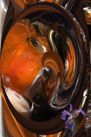
The third one was for fun. Those of you who saw power lines towers in it were absolutely right. I started with a totally drab power lines picture and decided to study in depth the Minimum... and Maximum... Photoshop filters. Used in combination with other filters on a colourful picture, results can be amazing. Here they were so and so, so I decided to add a bit of red with the graphic pen just for the fun of it. It's still so and so as far as "art' is concerned, but I think it's funny. And as Jacques wrote, who knows? Maybe if I were well known, it could be in a museum and people would scratch their head looking at it... I'm scratching my head myself, but I had fun.
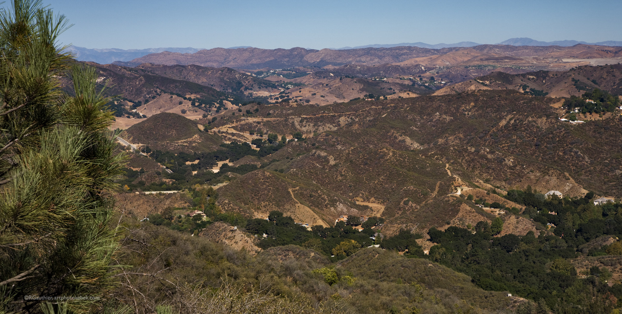
Look  at the now black and white sepia one, called Winters Of Years Past. You see my problem? Conditions were not good. I removed all "modern artefacts" line electric lines and poles and such. What is there left? Not much... That's why I put in some sepia, it seemed more appropriate. I made a new version, in black and white and with much more contrast. Maybe it's better, maybe not. I personally prefer the sepia version. Not a great picture, granted, but I find it very soothing as a desktop picture.
(Patrick, there are several approaches to sepia, as you know. I will cover this point in a technical post during the weekend.)
Now the one I call "The Bench". In my very humble opinion, this is by far the best of the three, at least now. Jacques (and others) saw directly through it: those extraordinary shades of grey... I was so taken by those shades that I lost contact with what contrast and brightness should be with snow. The new version is way better even if there is still some work to do. Thank you Jacques for the critique. The makings of an Ansel Adams shot? I don't know, the shades are certainly there, but I perhaps overcorrected and lost part of the shades in the snow, and this would be a shame. I shall have to rethink this one once again.
Speaking of Adams, he was a true master of the darkroom: burning and dodging he mastered thoroughly.
The last picture shows part of the work involved in this last version: electronic dodging and burning are now part of a non-destructive process, hence the multi-layered structure. I shall cover this in another Photoshop post in the near future. Layers are now also the name of the game.
I could not thank you all enough. And I hope that you will add your grain of salt to this post too, helping me to finally make a very acceptable shot with "The Bench".   :-)
Thanks once against to each of you. The diversity of opinions is to be expected and I shall talk about it in a future post: What conclusions can one draw from it?
•••••••••••••••••••••••••
Trois images sans titre et sans commentaire : le moment de vérité
Donnons d'abord un nom à ces trois images :
Hivers d'antan
Le banc
Monstres japonais
Du calme ! Ce sont les noms que je leur ai donné, pour le mieux ou pour le pire.
La troisième, Monstres japonais, c'était pour le plaisir de la chose. Ceux et celles d'entre vous qui y ont vu des pilônes de ligne à haute tension ont raison. J'ai pris comme point de départ une photo tout à fait quelconque de lignes à haute tension et j'ai décidé d'étudier à fond les filtres Photoshop Minimum... et Maximum... . Sur une image aux couleurs vives, utilisés avec d'autres effets, les résultats peuvent être étonnants. Le résultat ici était tout à fait ordinaire ; j'ai donc ajouté des touches de rouge avec le crayon électronique pour le plaisir de la chose. Ce n'est toujours pas fameux, mais je pense que c'est amusant. Et comme Jacques l'a écrit, qui sait ? Peut-être que si j'étais un artiste très connu, ça pourrait se retrouver dans un musée et les gens se gratteraient la tête en la regardant... Je me gratte moi-même la tête, mais j'ai eu bien du plaisir.
 La photo sépia qui est maintenant ici en noir et blanc pose un problème très différent. Je l'ai appelée « Hivers d'antan ». Les conditions étaient mauvaises (quoi d'autre ?). Je me suis débarrassé de tout ce qui nuisait comme les fils, les poteaux, et cetera. Il n'y avait plus de contact avec la modernité, enfin pas beaucoup, c'est pourquoi j"en avais fait une image sépia. La nouvelle version, en noir et blanc, est plus contrastée. Mieux ou pas ? Je préfère pour ma part la version sépia. Ce n"est pas une image extraordinaire, mais je la trouve très reposante comme fond d'écran.
(Patrick, je vais reprendre dans un nouveau message les différentes techniques que j'utilise pour créer une image sépia.)
Venons-en maintenant à celle que je trouve la meilleure, « Le banc ». Jacques (et d"autres)  a vu directement le potentiel considérable de cette photo avec ses extraordinaires dégradés. J'étais si concentré sur ces dégradés que j'en ai perdu de vue ce que devaient être les contrastes et la luminosité de la neige. La nouvelle version est bien meilleure je crois, même s'il reste du travail à faire.
Merci Jacques pour la critique. Une photo digne d'Ansel Adams ? Je ne sais pas, les dégradés sont très certainement là, quoique j'aie peut-être sur-corrigé dans cette nouvelle version. Ce serait une honte d'avoir perdu une partie des dégradés, il faut que je continue de méditer sur cette photo.
Parlant d'Ansel Adams, il était un véritable maître du contrôle de l'exposition à l'aide de masques.
La dernière image illustre une partie du travail impliqué dans la production de cette nouvelle version : le contrôle de l'exposition, par masques ou non, se fait maintenant à l'aide d'un processus non destructeur et réversible impliquant une structure multi-couches. J'aborderai ce point dans un message sur Photoshop, dans un proche avenir. Une chose est sûre, les couches sont maintenant le nerf de la guerre.
Je saurais trop vous remercier tous. J'espère  que vous allez encore ajouter votre grain de sel dans ce message, ce qui m'aidera à produire un « Banc » acceptable. :-)
Je remercie encore une fois chacun d'entre vous. La diversité des opinions était à prévoir. J'y reviendrai dans un prochain message.
RogerG


jeudi 5 février 2009

Sans commentaires ! / Without comment!

Three Untitled Pictures Without Comment
I am desperately trying to be faithful to the title and not comment myself. So here they are, pictures 001, 002, and 003.
For you to comment, vilify, tear apart, whatever.
I am, I think, a bit nervous.
:-)
•••••••••••••••••••••••••
Trois images sans titre et sans commentaire
Je tente désespérément de respecter le titre que j'ai donné à ce message, et de ne pas commenter moi-même. Alors voici les images 001, 002 et 003.
À vous de commenter, vilipender, tailler en pièces, comme vous voudrez.
Je suis en quelque sorte un peu nervveux.
:-)


mercredi 4 février 2009

The Ghost - A New Look / Le fantôme - un nouveau regard

The Ghost - A New Look (Thanks to Bill)
The first version was published yesterday. This new version has been reframed after Bill's (aka Butterbean) comment. I think that there is definitely some progress.
For downloading this picture, follow the procedure described here.
•••••••••••••••••••••••••
Le fantôme - une nouvelle version (Merci à Bill)
La première version a été publiée hier.  J'ai recadré l'image à la suite de la suggestion de Bill alias Butterbean. Je pense qu'il y a définitivement progrès.
Pour télécharger l'image, suivez les instructions indiquées ici.
RogerG

An Easier Way To Download Pictures / Façon plus simple de télécharger les images

Images in Posts: I Finallt Vanquished Blogger And Picasa web
Yep. I finally found a method to post pictures without using Picasa web. Pictures are stored on my own server and it is much simpler and more elegant as you will see.
In order to download a picture in a post (not in a comment, a post):
1. Click on trhe image in the message. The full resolution image appears in your browser.
2. Drag it to your desktop.
Thats's it...
••••••••••••••••••••••••
Images dans les messages : J'ai finalement vaincu Blogger et Picasa web
Absolument. J'ai troucé une méthode beaucoup plus élégante de mettre les images à votre disposition, sans utiliser Picasa web. Je stocke les images sur mon propre serveur et c'est maintenant beaucoup plus simple.
Pour télécharger une image dans un message (pas dans un commentaire, un message) :
1. Cliquez sur l'image dans le message. L'image pleine résolution apparaît dans votre fureteur.
2. Tirez-la sur votre bureau.
C'est tout...
RogerG

mardi 3 février 2009

Le fantôme / The Ghost

Le fantôme - une photo à la James Longster
J"ai créé cette image en ayant présent à l'esprit la façon de travailler de James Longster de Lafayette, IN., un artiste complet au mode de pensée complexe.
Commentez,. ne vous gênez pas. L'image n'est pas parfaite. L'angle aurait pu être meilleur entre autres, mais j'avais de la neige jusqu'à la taille. Assez, c'est assez.
••••••••••••••••••••••
The Ghost - A Picture À La James Longster
In creating this picture, I borrowed some ideas from James Longster from Lafayette, IN, a complete artist with a complex mind.
Do not hesitate to comment. The picture is not perfect. The angle could have been better among other things but I was waist deep in snow. Enough is enough after all!
RogerG
P.S.:I finally vanquished Blogger and Picasa web. Read here how to download pictures in the posts from now on!


dimanche 1 février 2009

Cold Sunset - Final Sequel / Coucher de soleil glacial - suite et fin

Cold Sunset - Final Sequel
In my humble opinion, nobody won or lost in the previous discussions about the wires (with or without?). I do admit that the image is very fine without the wires, as predicted by Patrick, and I am glad to have had the chance to create it. It is still true however that I wanted to make a statement with this image. This statement was a protest about the way man treat Nature. It is also the admission of the fact that for the time being, those wires are a fact of life, and there is also art in representing them.
This being said, Patrick drove a nail home yesterday and proved to me that Cold Sunset without wires was not s flat as I thought. Look at what he did with the picture! Electronic framing is one of Patrick's strongest points. His frame here is perfect and does justice to the picture, much more than what I would have thought.
Thanks, Patrick!
•••••••••••••••••••••••••••••••••••••
Coucher de soleil glacial - suite et fin
Quant à moi, la discussion d'hier sujet des fils électriques n'a fait ni vainqueurs ni vaincus. Avec ou sans les fils électriques ? J'admets volontiers que la photo est fort belle sans les fils, comme Patrick l'avait prédit, et je suis heureux que cette discussion m'ait donné la chance de la créer. Il demeure toutefois vrai que je voulais à la fois reconnaître un état de fait incontournable et protester contre la façon dont l'homme traite la Nature. À ce moment-ci à tout le moins, ils sont incontournables, et le fait de les représenter est aussi une forme d'art.
Ceci étant dit, Patrick a prouvé hier que l'image sans ses fils n'était pas aussi vide que je ne le craignais. Voyez plus bas ce qu'il en a fait ! Les cadres électroniques sont une de ses spécialités. Le cadre qu'il a réalisé ici rend vraiment justice à l'image, beaucoup plus que je ne l'aurais cru possible.
Merci, Patrick.